Sophisticated, Non-Traditional Nursery Paint Colors – Taupe and Mauve
It’s Week 2 of my One Room Challenge Nursery Design, and I’m elaborating on the paint color I chose because it really sets the tone and color palette of the room. In Week 1 I shared my inspiration for a girl’s nursery with colors that are not the white, light and bright colors you might expect of a nursery, but rather colors that are a bit quieter but still pretty. Part of this thinking was because I also contemplated using wallpaper, but even with just one accent wall it was going to be pretty costly. So I wanted a wall color that could stand on it’s own, make a statement, not be boring, but still be neutral. That meant I didn’t want a typical gray, white, or beige but a more complex color that is still warm. So I started looking into these Benjamin Moore colors in the taupe and warm gray category.

I really liked that these were not an obvious color like gray or white. They look like they could be gray, beige, pink, mocha, or all of the above depending on the light or what you pair with it. From these I narrowed it down to testing samples of three colors: BM Hampshire Taupe (990), Stone Hearth (984), and Smokey Taupe (983). (left to right)


It was really helpful to paint these on the wall because the lack of natural light in this room changed how they looked. As soon as I put these up it felt like I was taking a risk with these colors. And I was planning to paint the ceiling, too! I felt Stone Hearth (middle) was going to be a bit too dark. I debated between Smokey Taupe (right) and Hampshire Taupe (left) and in the end chose Hampshire Taupe because it had more of a richer, pinkish tone which made it look more like a mauve. I thought it was fitting for a girl’s nursery! I went with BM Simply White (OC-117) for the trim and doors because it’s a classic warm white that goes with almost everything.

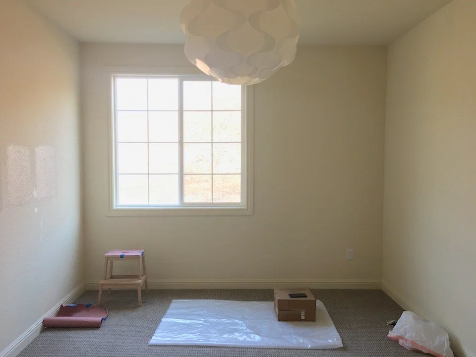
BEFORE
Now for the before and afters! Here is the room being used as our office.


We moved everything out.


IN PROGRESS
Here are some painting progress shots. We started with painting the ceiling which was not easy. The ceilings are 9′. The second photo is a shot from outside the room’s doorway. Admittedly, at this point I was nervous. It looked so purply, which I didn’t want, and kind of dark! But I was committed with all the paint I bought, and my husband convinced me to press on and finish the job.


It took us a full long weekend to prep the room, paint the walls, the ceiling, and all the trim and doors. It also happened to be over 100 degrees in the Bay Area that weekend which is not normal and didn’t make it any easier. If you want a few pros and cons about painting rooms yourself check out these posts: The Truth About Painting Part 1 and The Truth About Painting Part 2.
AFTER
Here is the nursery freshly painted Benjamin Moore Hampshire Taupe on the walls and ceiling! Trim is BM Simply White. As you can see the lighting really affects how color looks around the room.


At first I thought maybe it was too purply, but after it dried the more I see it the more I love it! It’s got a grayish pinkish hue. It’s calming and soothing and makes you want to cozy up and take a nap, perfect for baby! It’s a sophisticated color for a baby, but I like that it’s interesting, unique, feminine and still very neutral. What do you think of the color?!
READ MORE ABOUT HOW THIS NURSERY CAME TOGETHER AND MY DECOR SOURCES.
Week 1 – It’s A Girl! Neutral But Not Boring Nursery Inspiration Week 3 – What’s Missing From My Nursery Color Palette? Week 4 – Nursery Furniture Picks Week 5 – Cute Affordable Nursery Art Week 6 – Neutral Nursery Decor and Accessories Picks Week 7 – My Baby Girl’s Neutral Nursery Reveal To see more One Room Challenge participant rooms head here.
Get my free guide to decorating a new home and more home decor tips and ideas in my monthly newsletter. Sign up here.


